
Bringing focus and integrated packaging systems to a wellness brand in a commonly overwhelming wellness category.
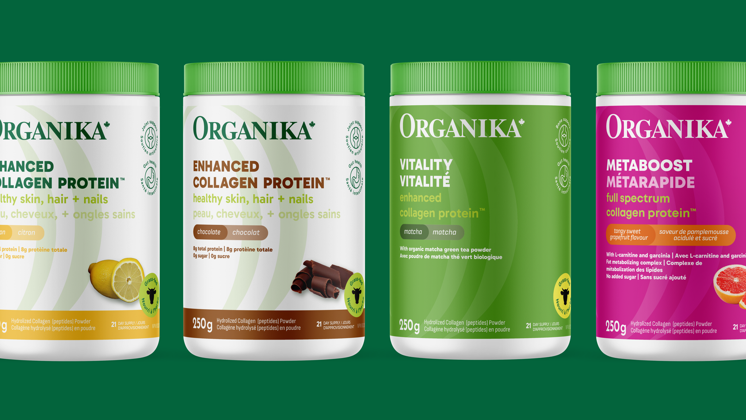
Work Done at Dossier Creative
Role
Packaging Concept + Design
Brand Touchpoints + Assets Design
Brand Guidelines
Project Team
Strategy: Pat Ho, Aarti Kamat, Austin Chisholm Creative Direction: Don Chisholm
Design: Francesca Vedovato, Cali Martin
Production: Reg Dick, Naomi Mendoza
Wellness isn’t about quick fixes, it’s a lifelong commitment to supporting oneself and others.
Strategy
The wellness space can be noisy and overwhelming, but Organika didn’t need to shout. They just needed to lean into what they’ve always done best: showing up with care, expertise, and guidance.
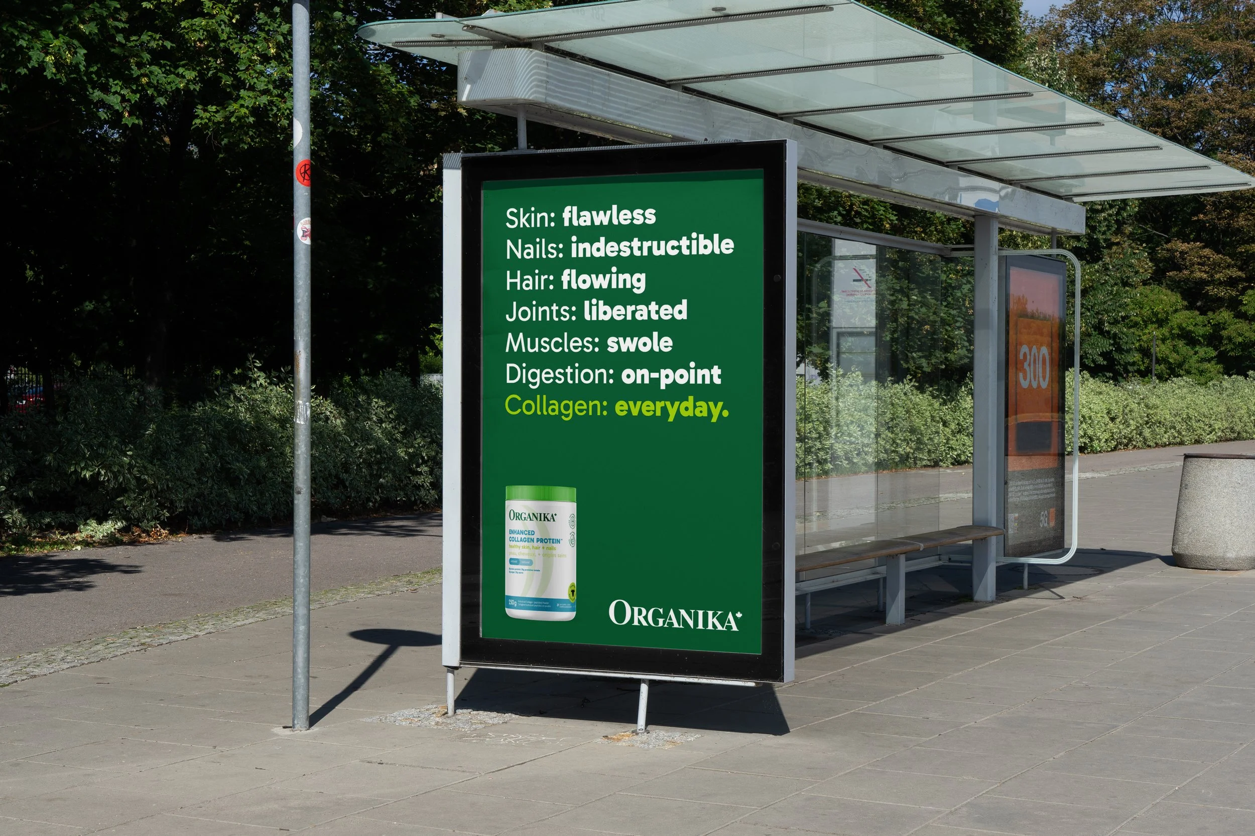
We repositioned the brand around the idea of being a steady companion in consumers’ wellness journeys – real products, for real people, backed by real support. A brand strategy that carved out space for them to lead with heart and stay focused on what matters: helping people feel their best.

Addressing the elephant on their packaging. Copy.
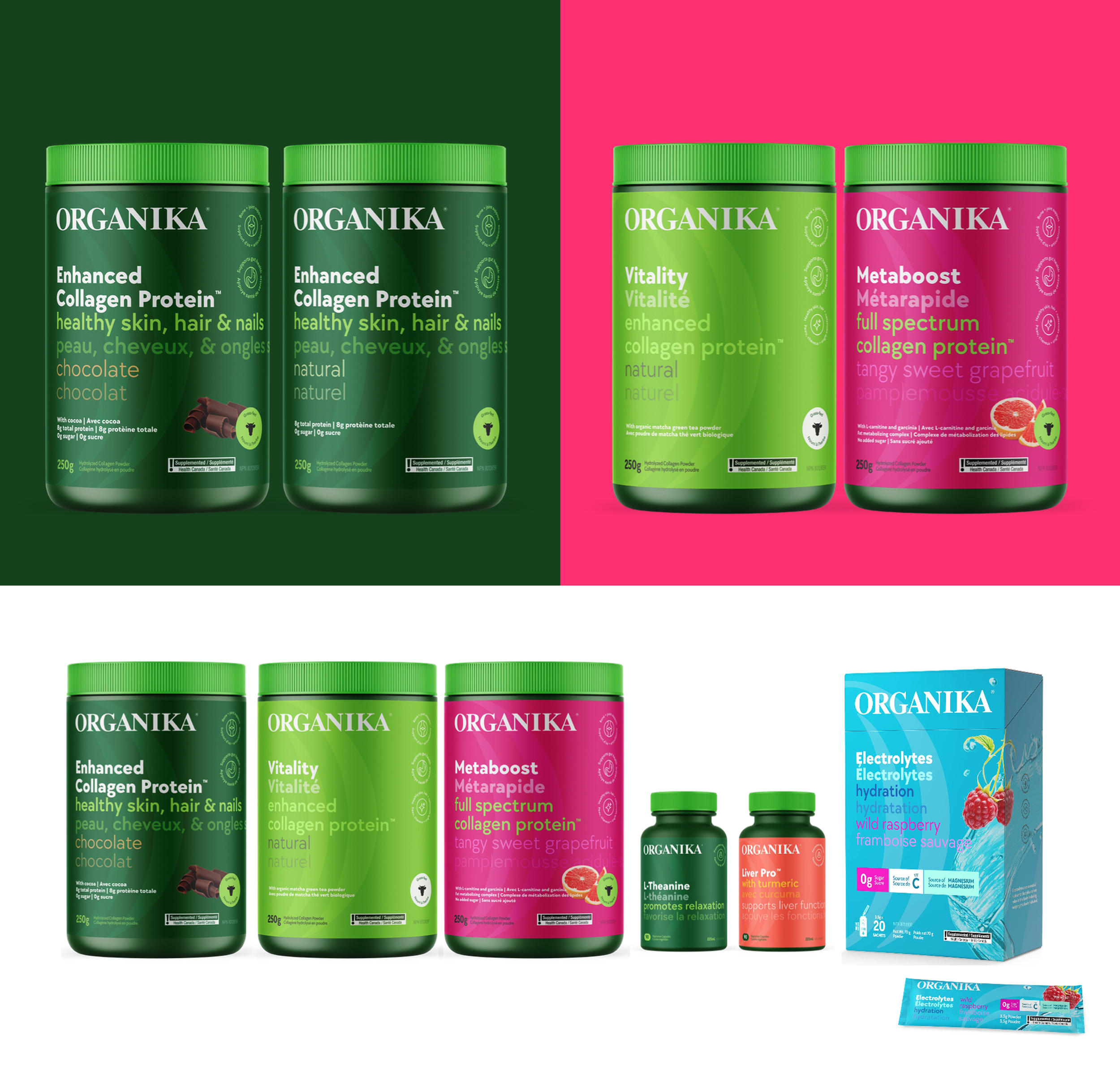
Packaging Concept 1
Language is one of the most powerful design tools. Every font, letter, comma and period can have major impact on how a design is embraced by its viewers. The goal for this concept was to make the content the hero by addressing and reducing the amount of content and distracting graphic elements on Organika’s packaging to the bare essentials. With beautiful typography and bold colour choices, Organika can embody wellness and clarity more than ever.
Packaging Concept 2
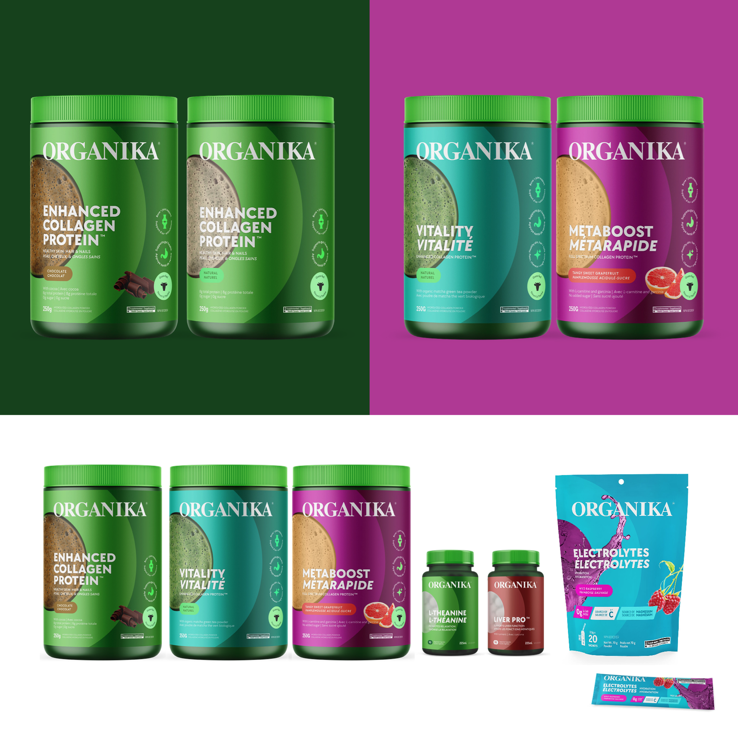
Zeroing in on the Organika “O”
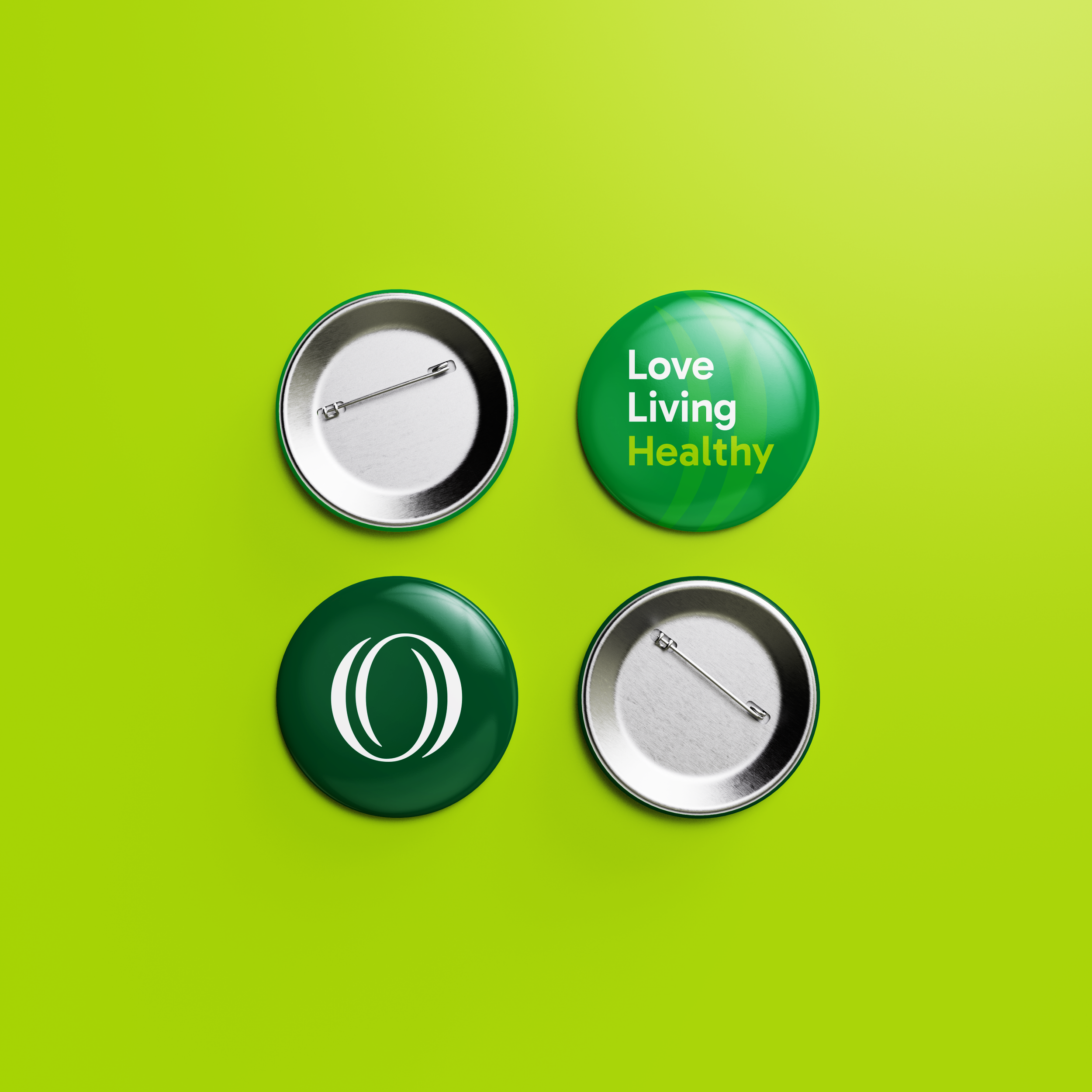
We drew inspiration from Organika’s iconic “O”. The goal of this concept was to create a strong visual anchor that reflects Organika’s mission to be a wellness brand people can truly lean on. It’s also a visual device to further communicate product offerings – pushing forward the idea of being leaders in wellness and product transparency. The O simply felt right. It’s simple, it’s steady, it’s whole.

Packaging Solution
A fresh new look, while reducing “buggy” shock
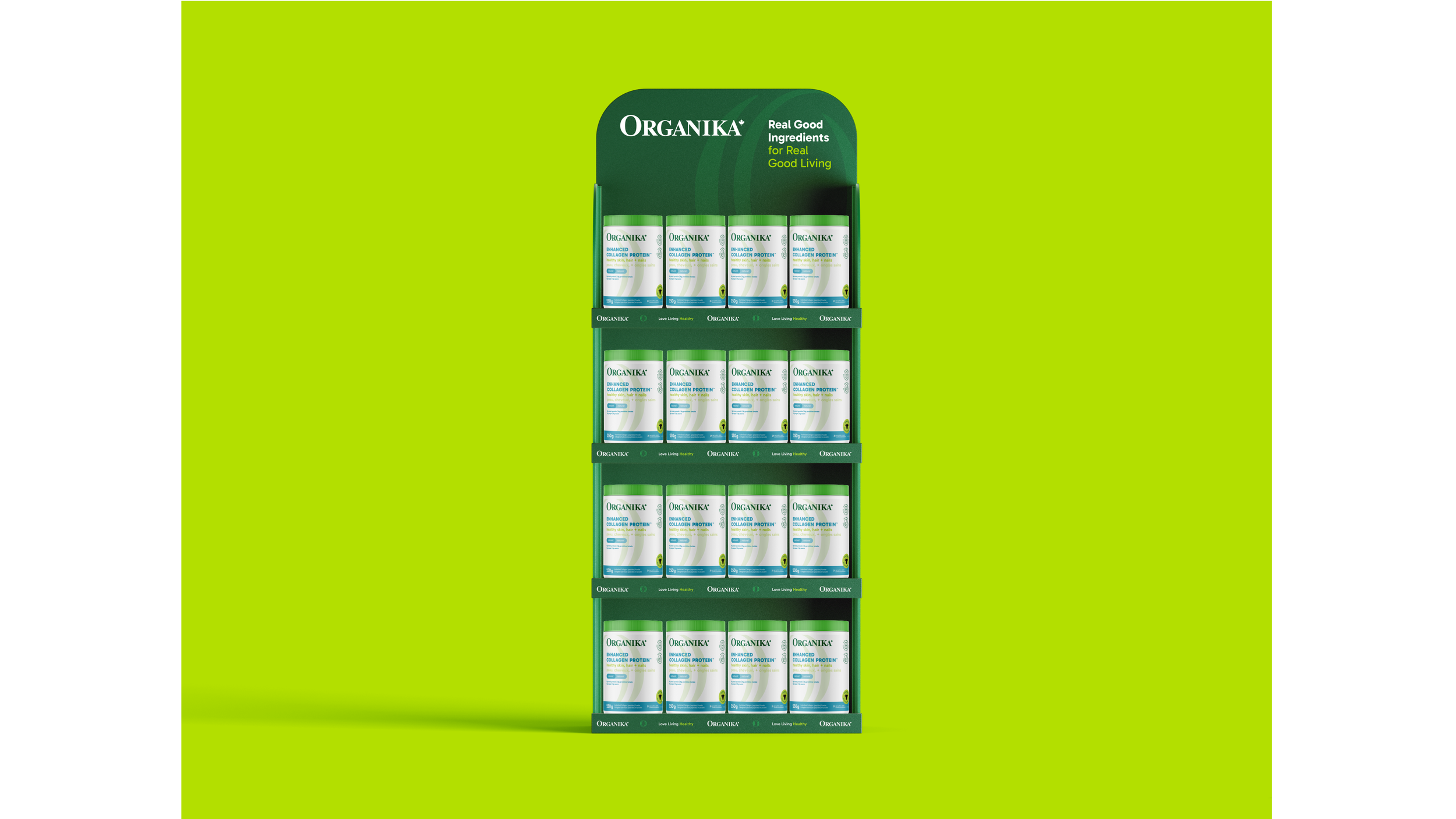
Refreshing Organika’s packaging meant designing with both scale and sensitivity in mind. With 200+ SKUs and a strong stream of product innovation, they needed a system with enough structure to stay consistent and enough flexibility to keep evolving.
One of our early challenges was balancing freshness with familiarity. The Organika team was excited to modernize their look, but also mindful of not veering so far that loyal customers felt lost. So we focused on refining, not reinventing. We kept key brand cues like the signature green lid, brand mark position, and consideration of similar type treatments – all the while introducing a new cascading copy system to bring hierarchy and clarity across product lines.
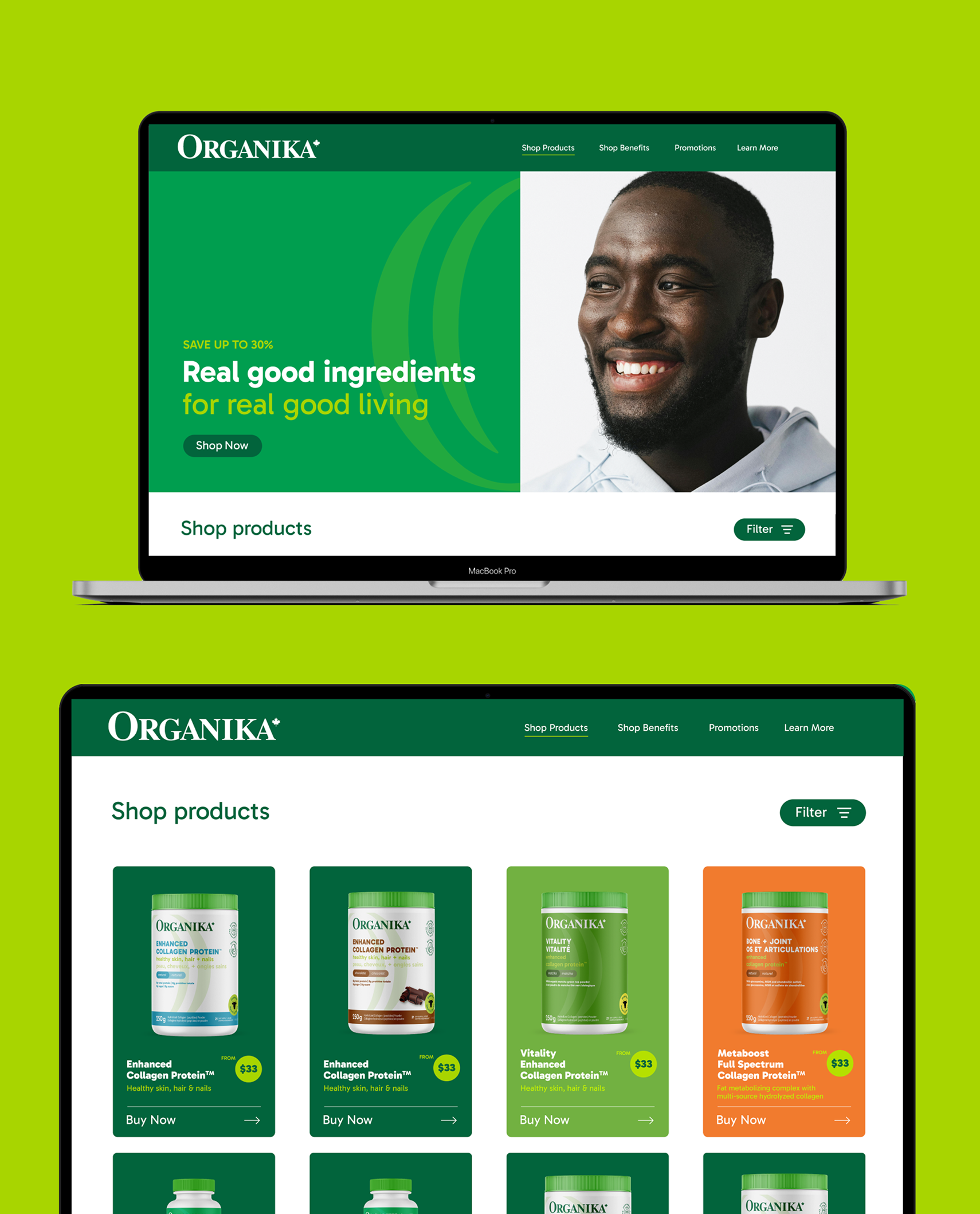
The result is a packaging system that’s both considered and scalable – a versatile framework with refreshed content strategy, custom icons, and a colour system that helps differentiate ingredient-led products from need-state solutions. And of course, keeping Organika’s core identity intact.
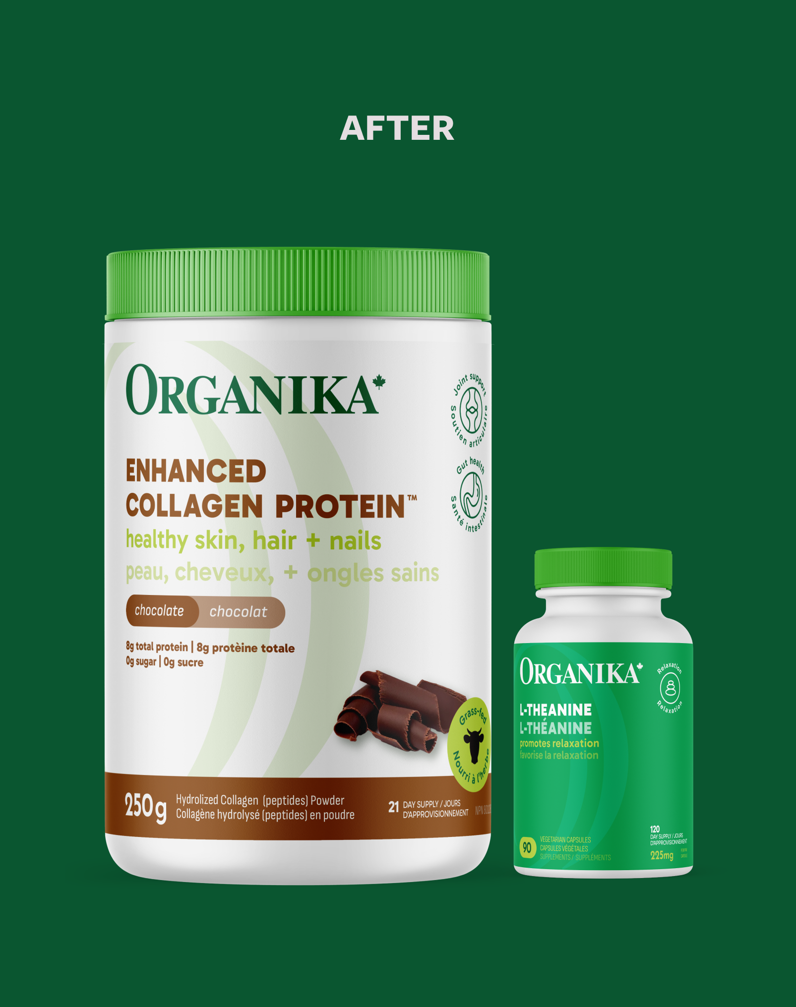

The care is all in the details. Refreshed icon designs inspired by the Organika “O” allowed for more approachable and clear messages for product benefit callouts.

Results
Empowered Client
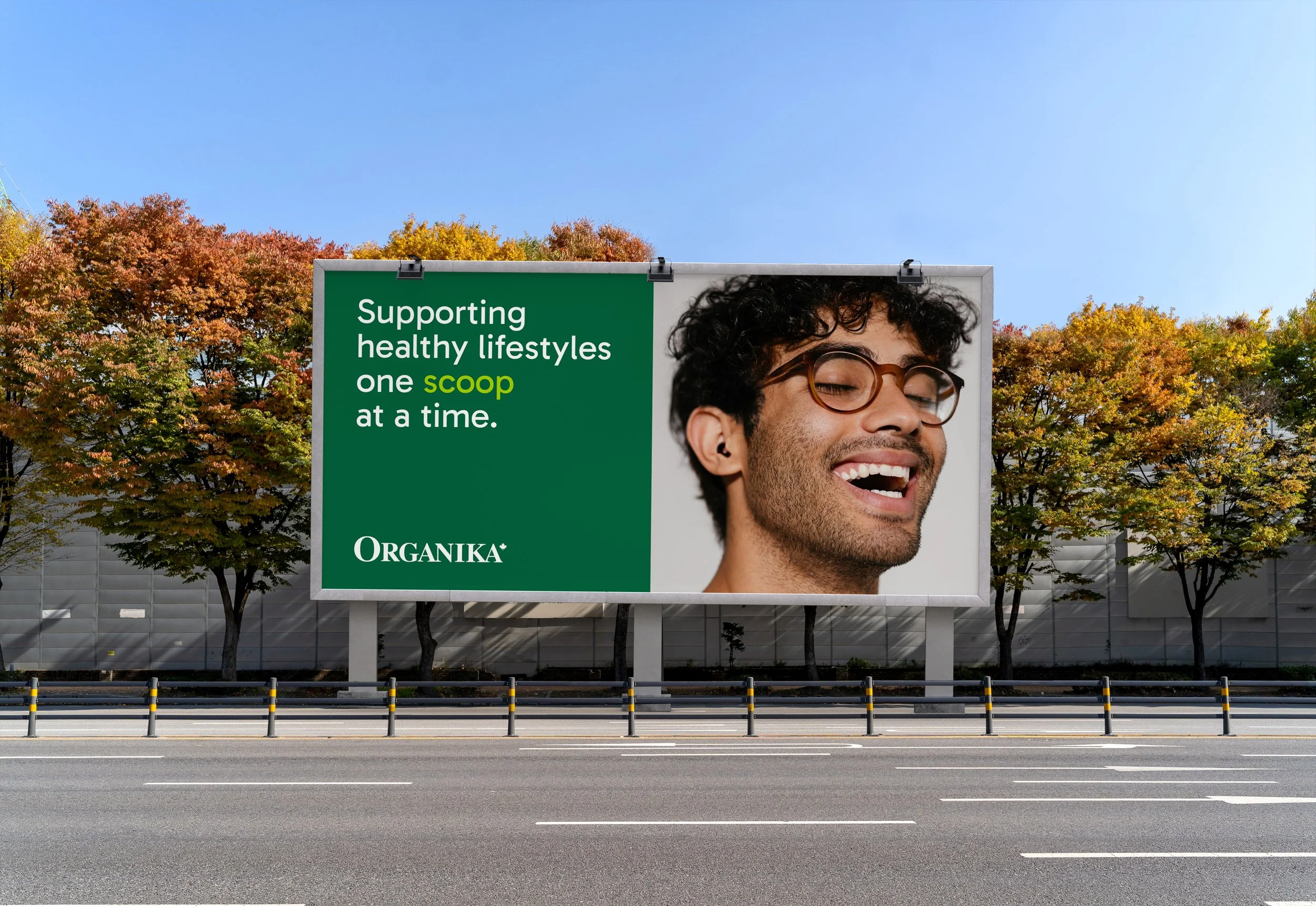
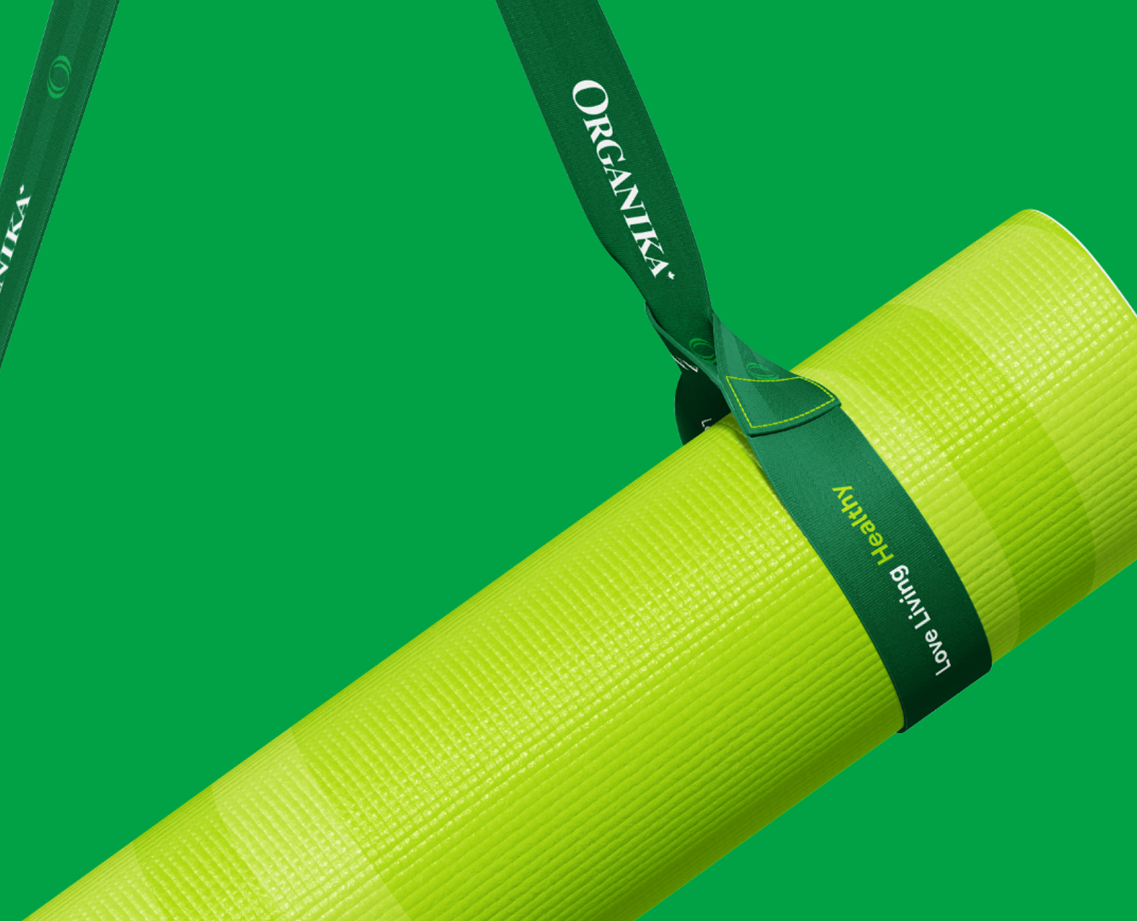
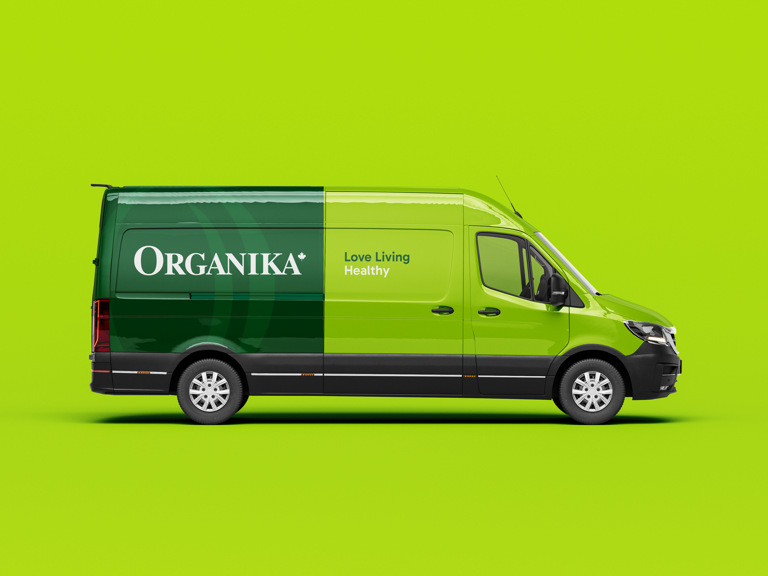
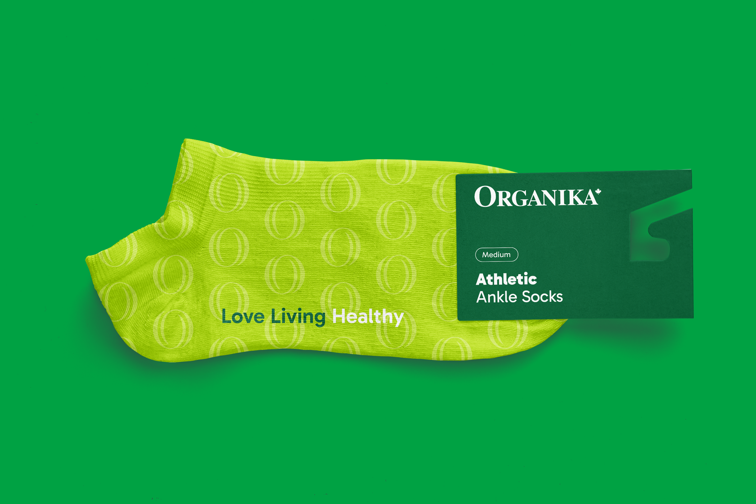
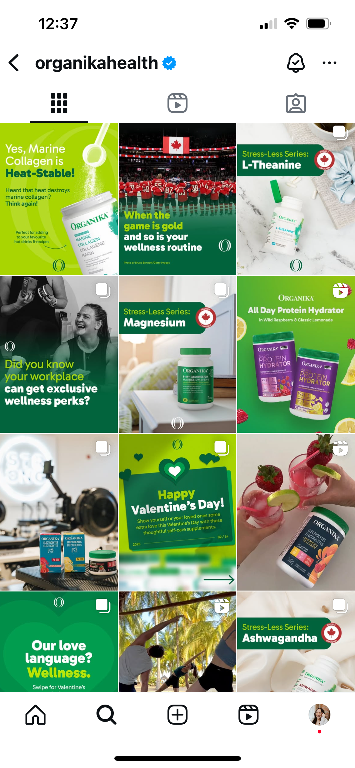
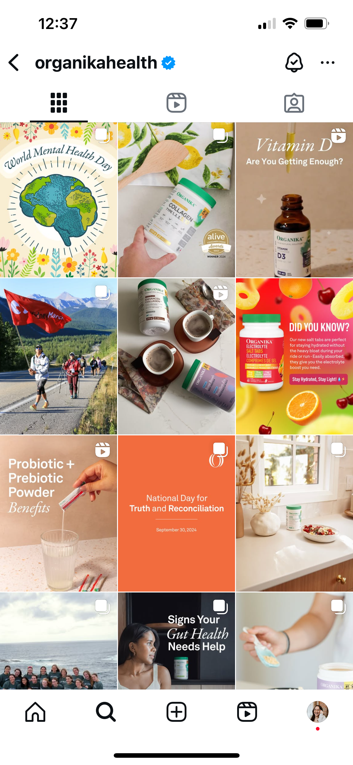
It’s rewarding seeing a client take the work and make it their own. Watching Organika run with the strategy and design – from their speedy social media refresh to their thoughtful rollout of the packaging system – was such a joy. Their enthusiasm and engagement throughout the process made it all the more meaningful, and it feels so fulfilling to see the brand continue to grow with confidence.
After
Before